

ANNUAL PLANO TURKEY TROT
Brand Identity + Event Campaign
Community-driven race identity designed for retail + event environments
Built scalable visual system
Designed for retail visibility
Balanced playfulness + clarity
Role: Brand Identity, Campaign Design
Scope: Logo, signage, merchandise
Audience: Community runners
THE CHALLENGE
The Plano Turkey Trot needed a recognizable identity system that could scale across race signage, merchandise, and digital promotion while capturing the spirit of community participation.
CONCEPT: MOVEMENT THROUGH COMMUNITY
The Plano Turkey Trot identity transforms a simple footprint into a dynamic storytelling system, merging motion, environment, and typography to reflect the collective energy of race day. By embedding natural elements and hand-drawn lettering within the form, the mark captures both the physical journey of the run and the shared spirit of community, resulting in a visual identity that is expressive, scalable, and rooted in place.
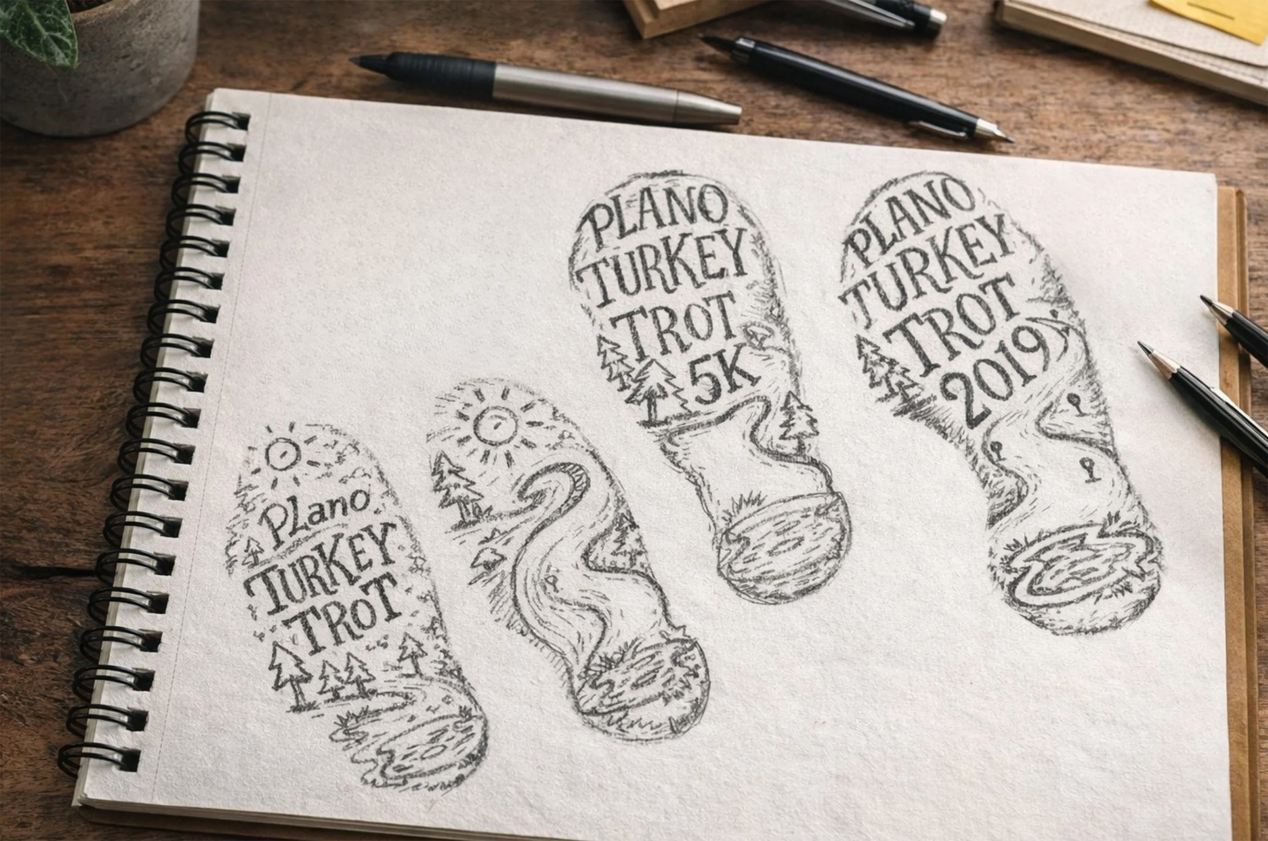
Early exploration focused on footprint symbolism and environmental storytelling
Refining typography and integrating illustrative elements into a cohesive mark


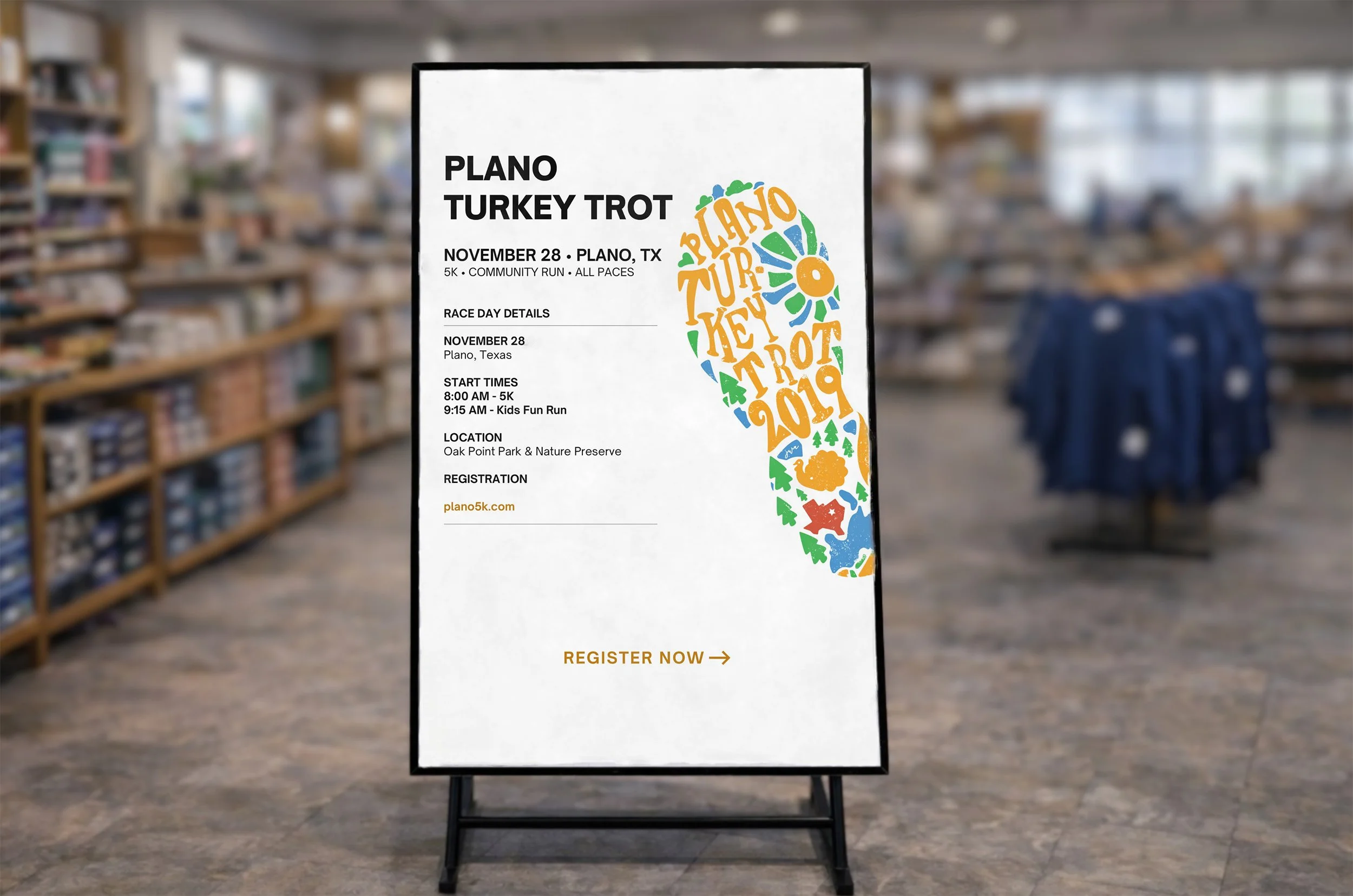
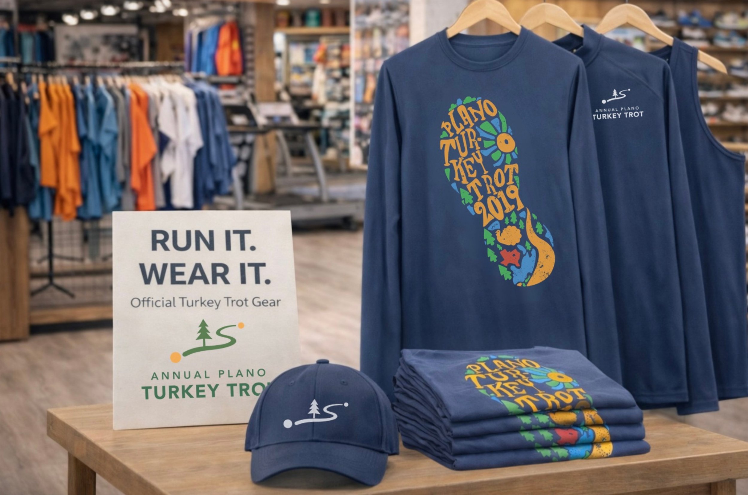
SCALABLE BRAND SYSTEM
Works across retail + event environments
Adapts across audiences + race tiers
Maintains clarity at distance